Work
Contacto
Work
Contacto
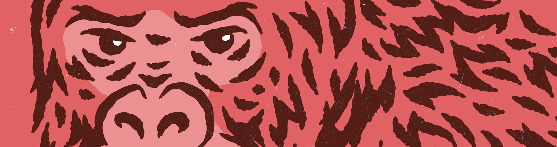
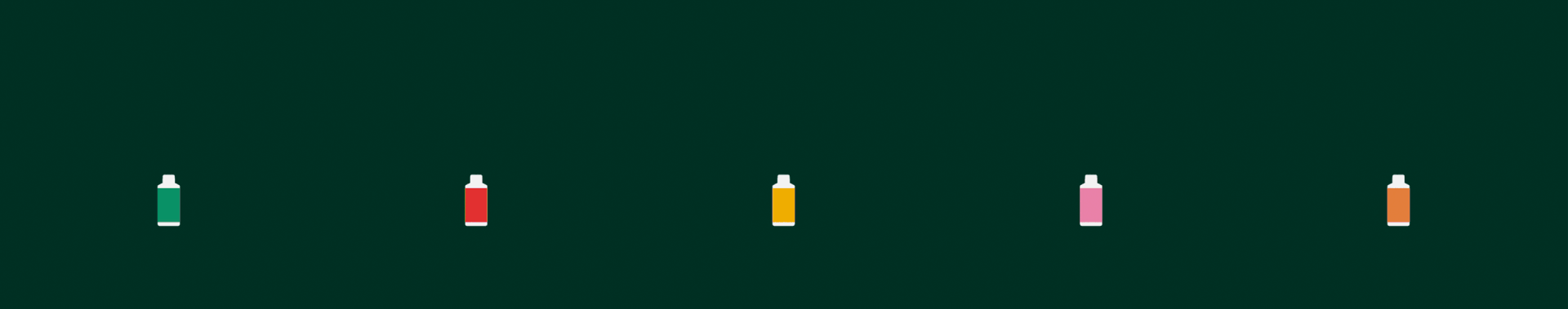
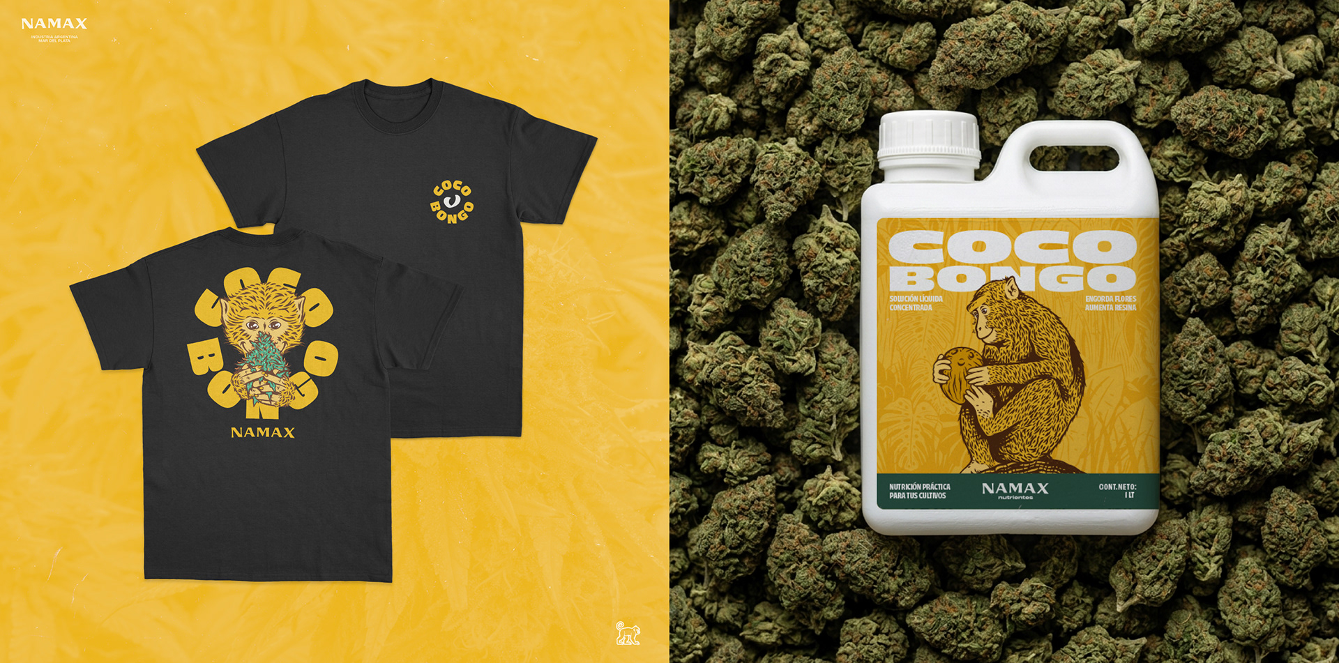
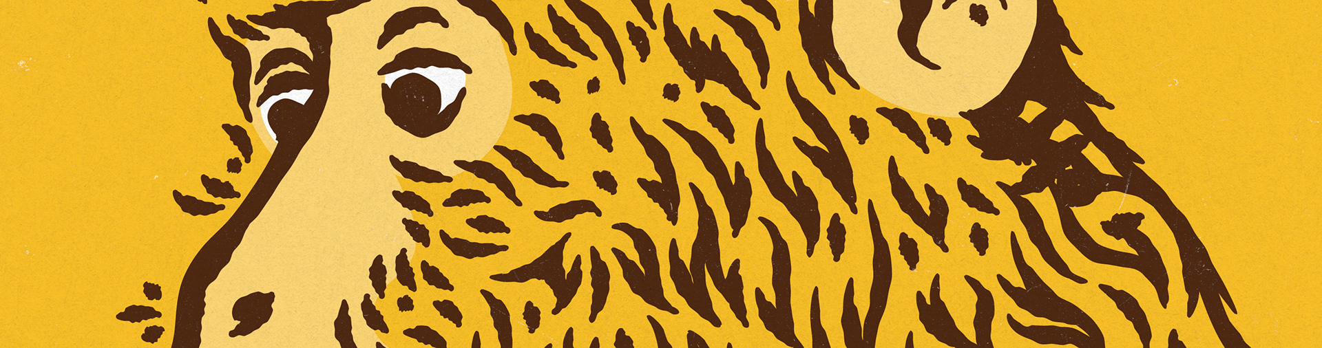
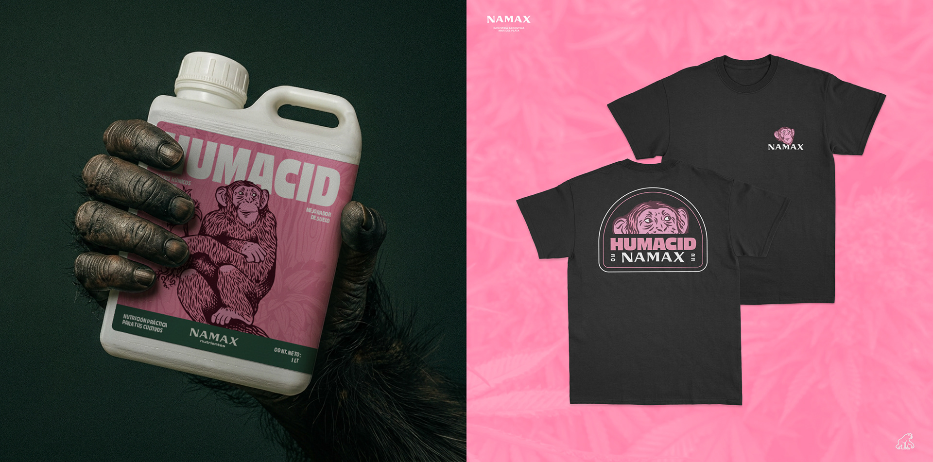
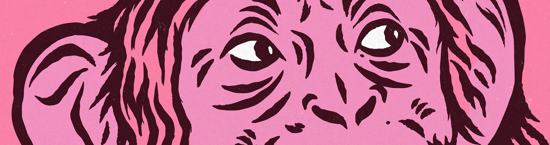
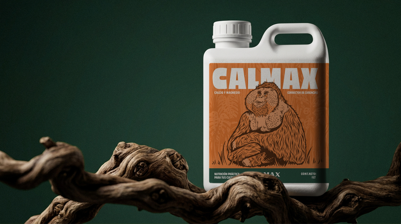
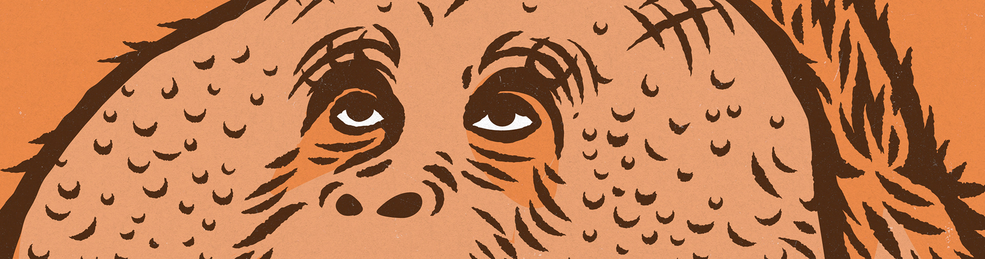
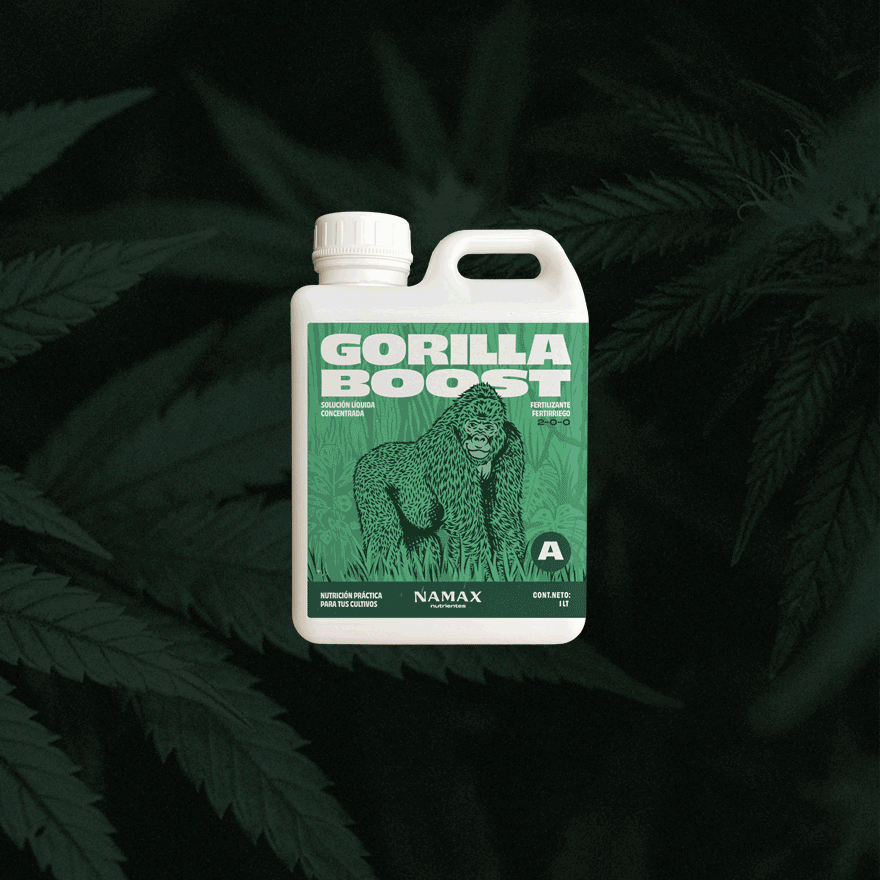
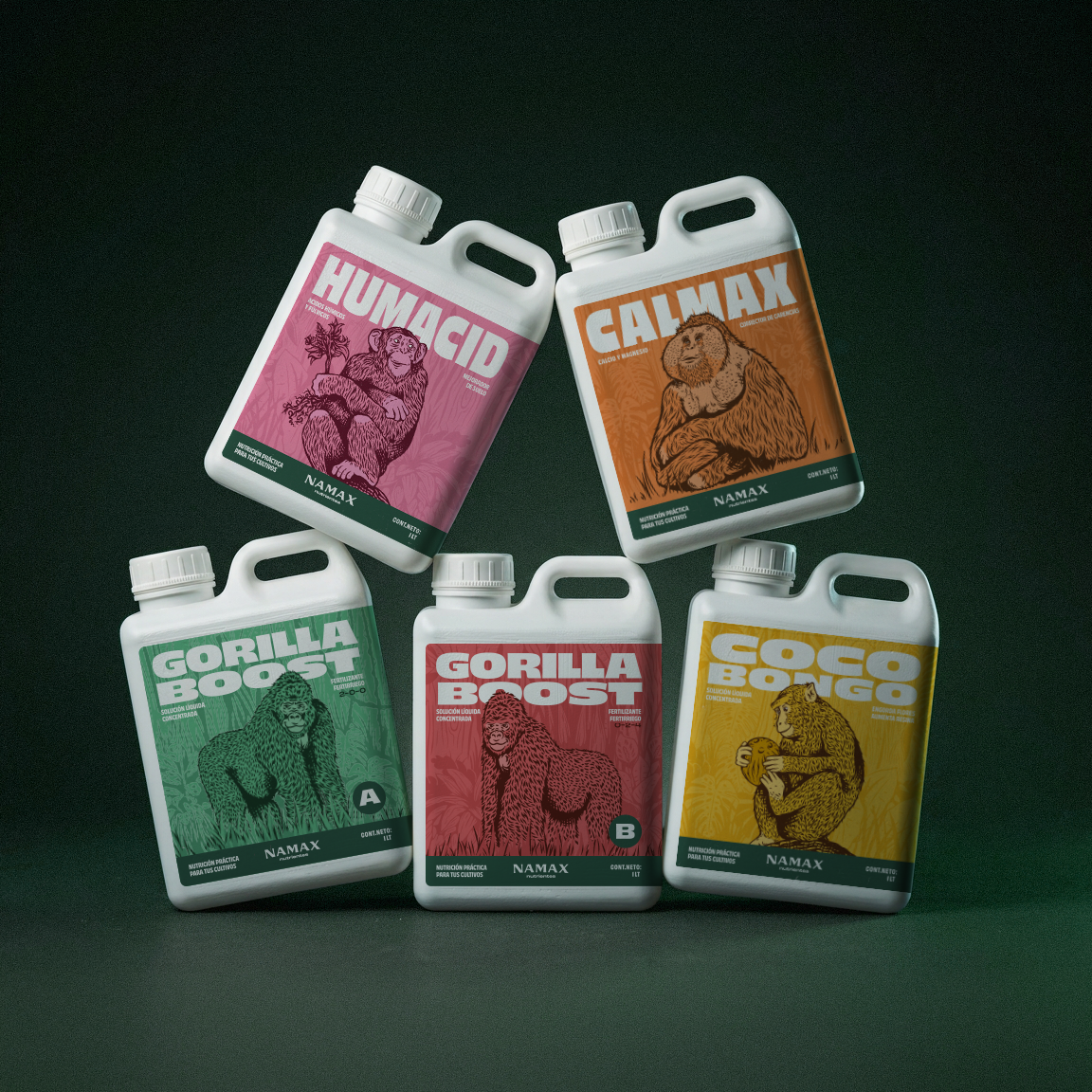
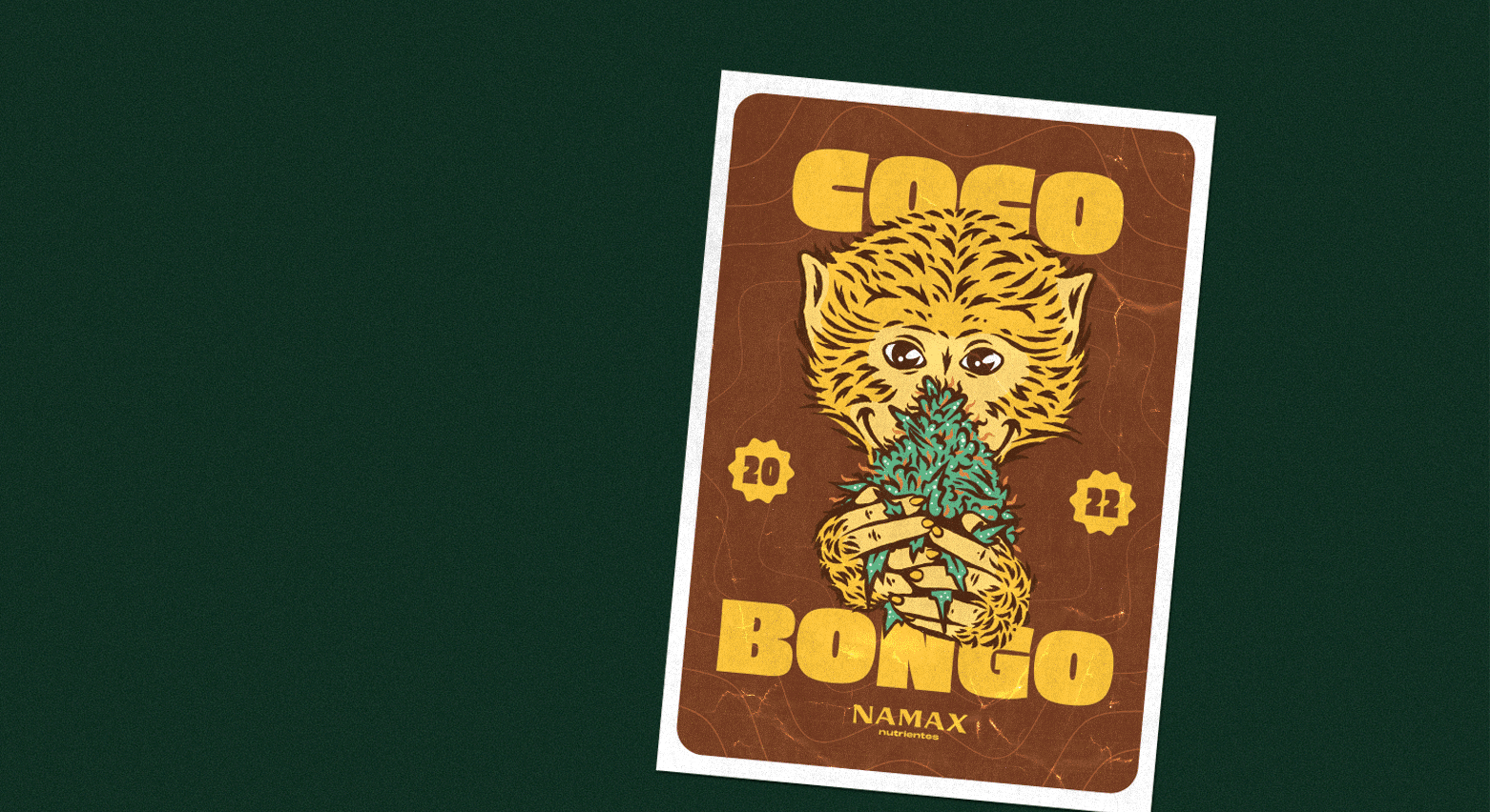
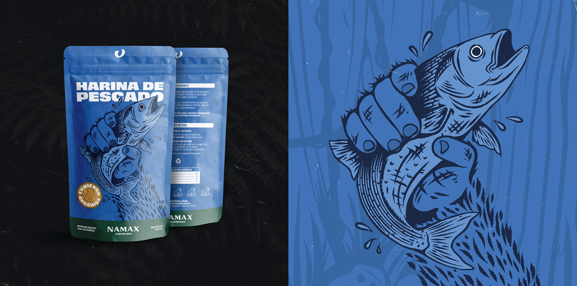
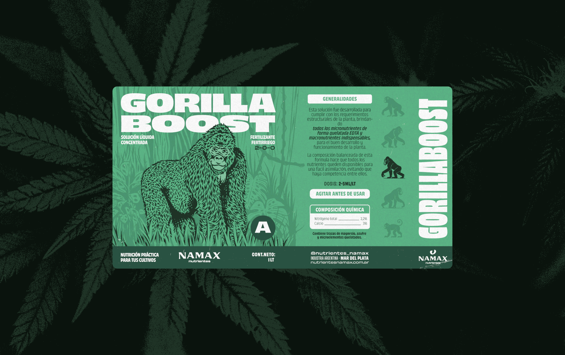
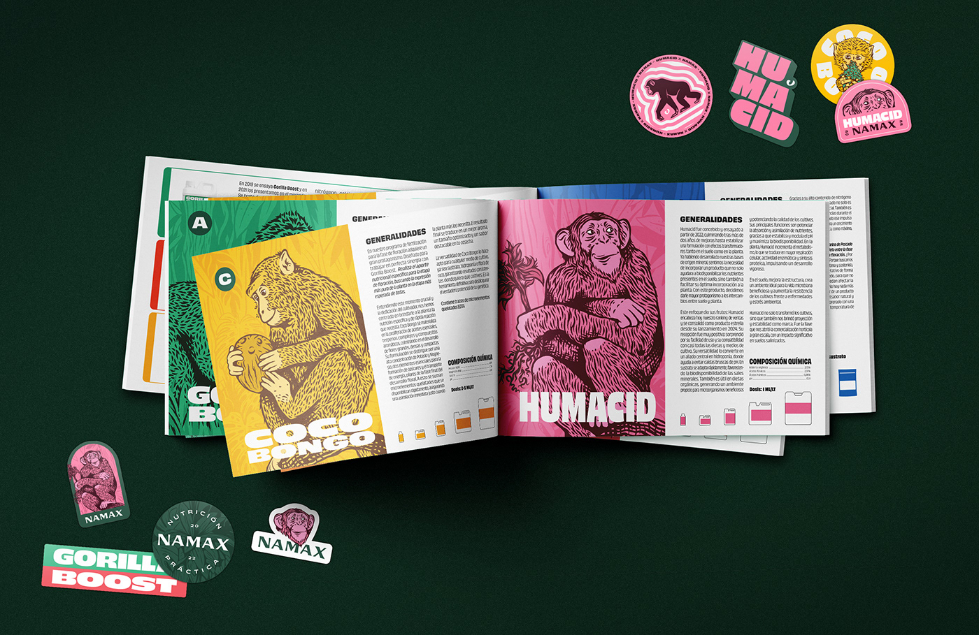
NAMAX - DISEÑO DE ETIQUETAS
↑
Back to Top